Score and ROC Curve
The results of Red Analyze are measured through the Score and ROC Curve.
Score
For Red Analyze High Detail, the overall score for the view is the maximum defect probability in the view. In this mode, the Red Analyze tool returns a probability map indicating, for each pixel location in the input image, the probability that the pixel represents a defect. The defect probabilities are normalized such that the probability that the pixel is a defect, plus the probability that the pixel is background, totals to 1.0.
The Scores graph lists all images that were labeled and scored as well as the two thresholds (T1, T2) for the graph. The first threshold determines the maximum value a True Negative (truly lacking a defect) can have before it is unsure about its value. The second threshold determines the minimum value a result must have before it is considered a True Positive (truly containing a defect). Values in between are considered False Positives or False Negatives, depending on their label, and will be assigned to the Inter column of the confusion matrix.
Using both the T1 and T2 thresholds can create an Inter (or marginal) class. If you encounter this, you can set up a process to flag Inter any images for a human inspector to review, or those images can be saved for further re-training (while offline). As a another fail-safe, images in that category could be rejected and sent to a re-work bin.
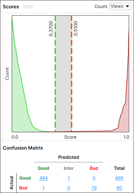
Both thresholds (T1 and T2, in the image below, T1 = 0.37 and T2 = 0.51) are interactive on the graph and can be adjusted. Adjusting these values interactively will also automatically update the Threshold parameter setting.
-
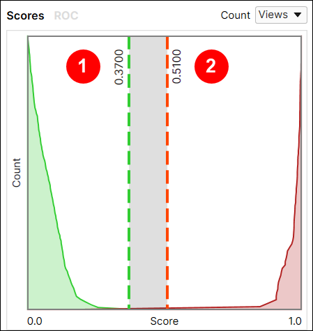
Setting the Threshold here makes the tool “less picky” about what it predicts as a defect, generating more False Positives.
-
Setting the Threshold here makes the tool “more picky” about what it predicts as a defect, generating more False Negatives.
Score Count Filter
The Score Count filter allows you to filter the statistics returned by the tool.
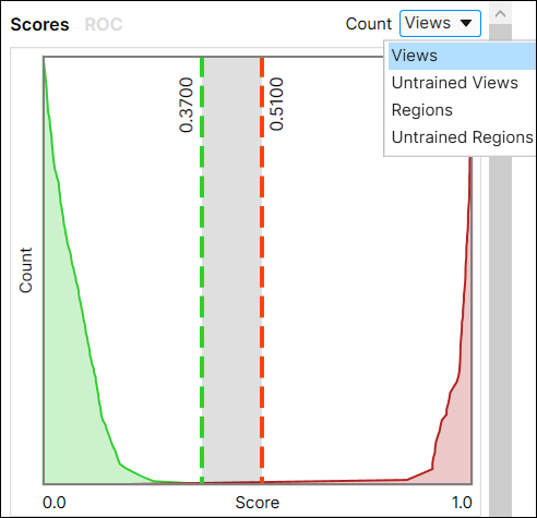
- Views: Returns the highest scoring area for each view.
- Untrained Views: Returns the highest scoring areas for each untrained view.
- Regions: Returns the aggregate scoring, at the pixel level for Regions (this requires that regions have been labeled).
- Untrained Regions: Returns the aggregate scoring, at the pixel level for untrained Regions (this requires that regions have been labeled).
If there are no untrained Views, the Histogram will be blank.
If there are no labeled regions the following applies:
- The Count filter for Regions will look the same as that of Views.
- The Count filter for Untrained Regions will look the same as that of Untrained Views.
Receiver Operating Characteristics (ROC) Curve
The Receiver Operating Characteristics (ROC) curve measures the Sensitivity over the Specificity, given a specific threshold.
- Sensitivity is the ability to detect a Positive result (has a defect).
- Specificity is the ability to detect a Negative result (no defect).
This is performed by evaluating the results between the two thresholds.
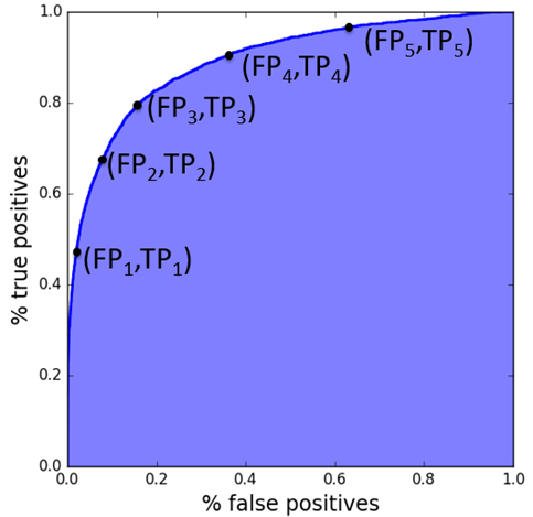
Area Under the Curve (AUC)
This topic provides information about how to perform statistical interpretation of the Area Under the Curve (AUC). The AUC determines how well a result is being obtained. Generally, with the AUC, a 1 being a perfect result; anything above .8 being a good result (generally speaking); and .5 being completely random.
The AUC is independent from any threshold, and provides a statistical test based on the ranking of scores only, with no assumptions on the score distribution. The AUC is a robust measure of the classifier's separation power.
The AUC is:
- 0.5 for a random classifier
- 1 for perfectly discriminating classifier
- not a percentage
- independent of any threshold