Display
The Display element is used to display the image being processed, and allows users to interact with graphics and Controls Functions while the project is in deployed mode. It also allows users to edit certain VisionPro vision tools while the project is tested or deployed.
| Program Mode | Test Mode / Deployed Mode |
|---|---|
|
|
- To interact with the Display element in the WebPage, a Button element can be added, and various Click Command properties will be enabled to interact with the image. For more information about them, see the Button Click Command - WebPages.
- When using the Create a WebPage from Selected Cells option to generate a WebPage, if a Controls Function (such as an EditRegion function) is selected, the InputImage function it references will automatically be selected and configured, even if the cell containing the InputImage was not selected at the time the WebPage was created.
| Property | Description |
|---|---|
| Enable Graphics | Determines whether or not static graphics will be displayed on the Display. This property is enabled by default. |
| Image Rotation |
Specifies the rotation of the image being displayed:
|
| Source | Specifies the image that will be displayed. |
| Click to Edit | Determines whether or not starting graphic editing via a mouse click is enabled. This property is enabled by default. |
| Enable Zoom Label |
Determines whether or not a zoom level label will be displayed on the Display. This property is disabled by default. Note: By using a Label element and setting the Text property to the Zoom Level tag, a custom zoom label can be created that also shows scale value.
|
| Selected Graphic |
Can be bound to the Data tag of a Display Data Editor (e.g. $WebPages.WebPage.DisplayDataEditor.Data) to allow the selected graphic on the Display to be edited numerically, via a keyboard. |
| Selected Handle |
Can be bound to the Data tag of a Display Data Editor (e.g. $WebPages.WebPage.DisplayDataEditor.Data) to allow the selected graphic handle on the Display to be edited numerically, via a keyboard. |
| Show Edit Buttons |
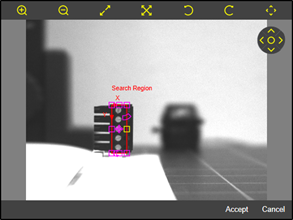
Displays Accept and Cancel buttons for use with a selected graphic on the Display. When a graphic has been selected, the integrated Accept and Cancel buttons will automatically be displayed. This property is enabled by default. Note:
The Accept and Cancel buttons are only visible in deployed mode, and are hidden unless an editable graphic has been selected. |
| Show Pan Control | Determines whether or not the pan control will be visible on the Display. When enabled, and in deployed mode, the image can be moved using the arrow icons on the control, and the image can be realigned to center by pressing the circle icon in the middle of the control. This property is enabled by default. |
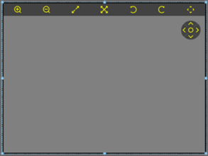
| Show Toolbar | Displays a toolbar along the top of the display for the most common functions for interacting with the image: zoom controls, fit and fill controls, image rotation controls, and a control to show and/or hide the pan control. This property is enabled by default. |
| Zoom Level |
Sets the zoom level of the displayed image.
|
| Zoom Type |
Sets the zoom type:
|